REVISTA ANDEAN VOL. 2
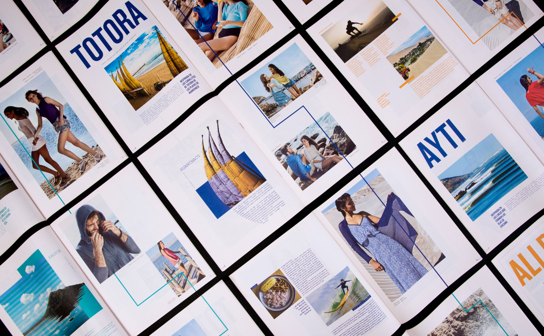
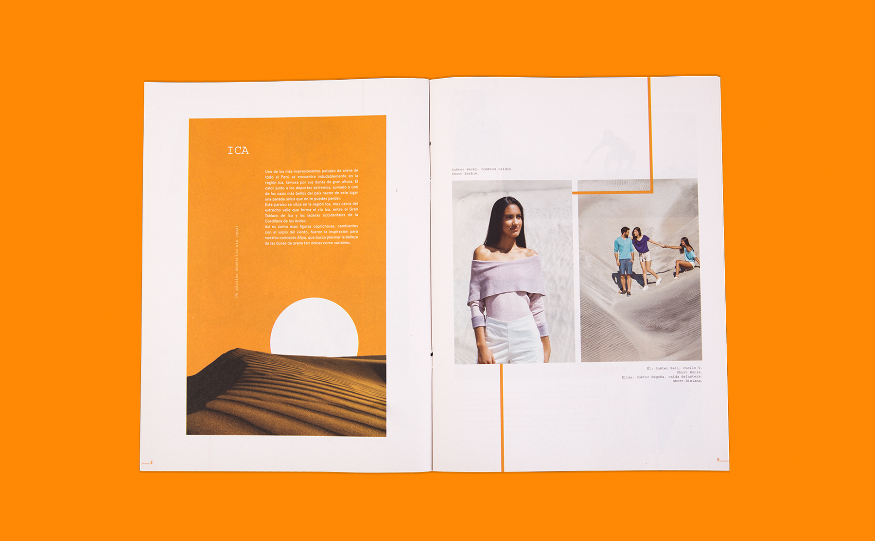
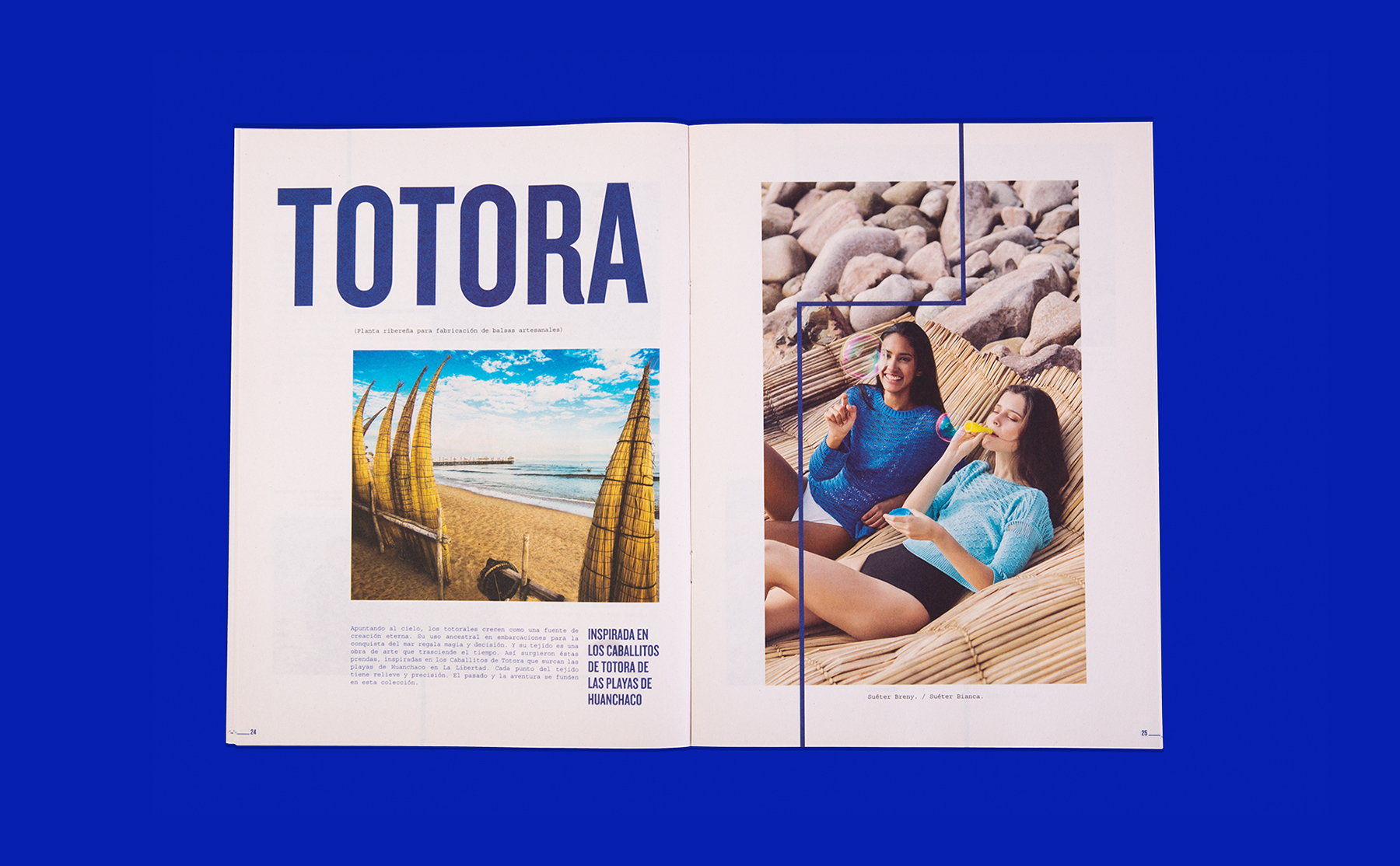
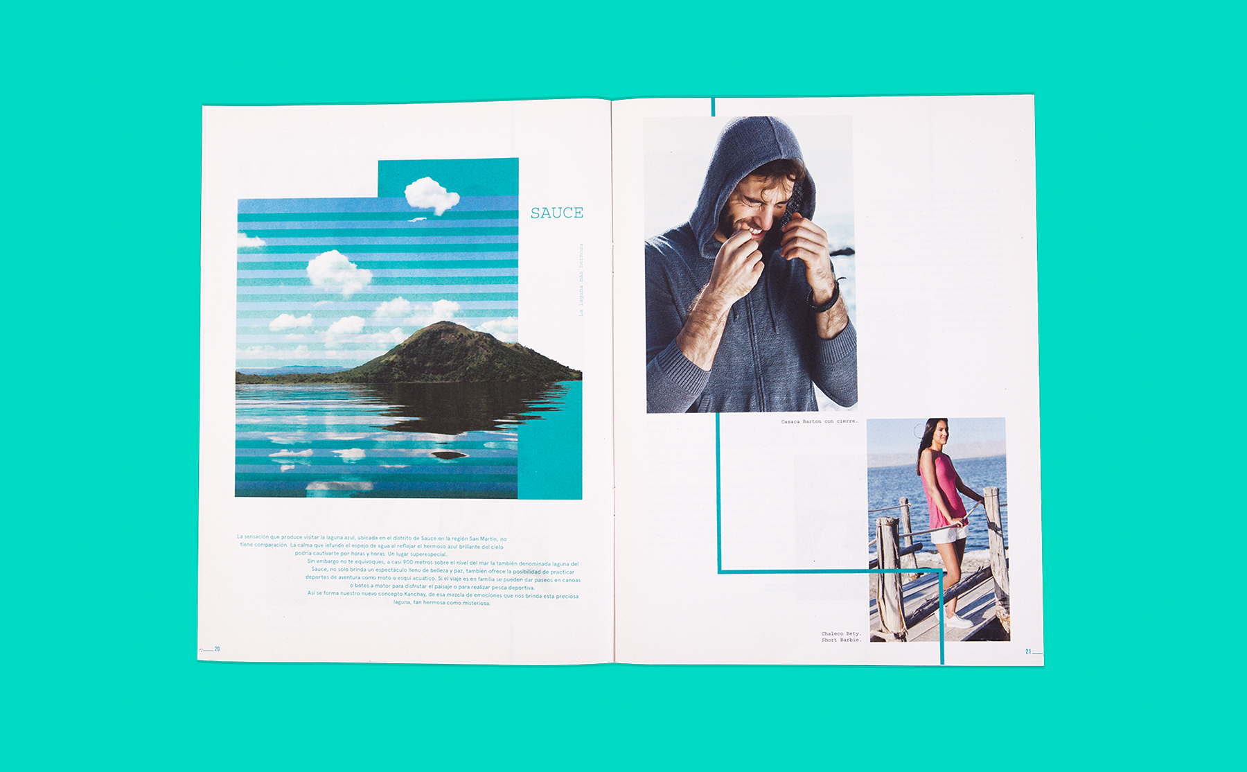
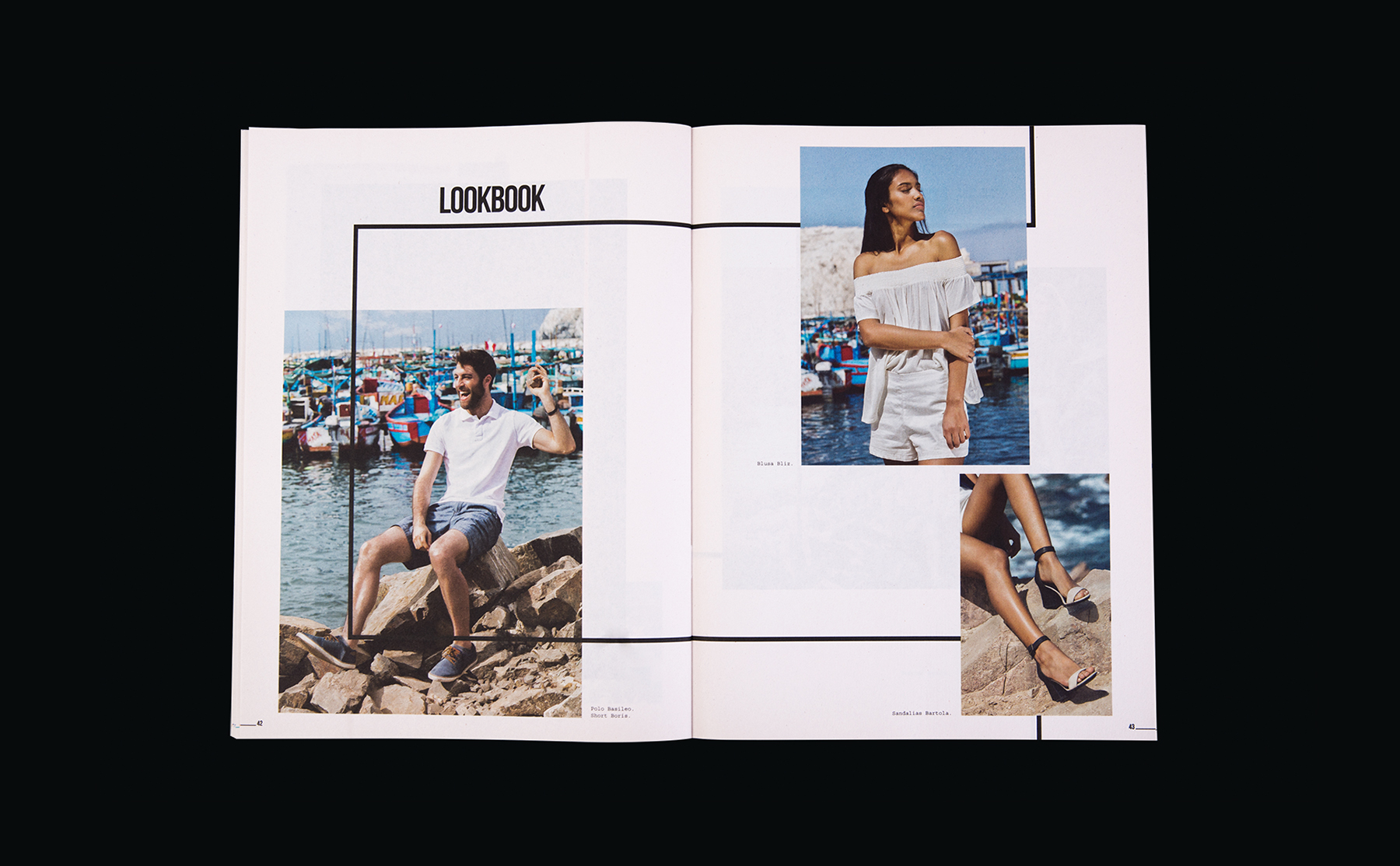
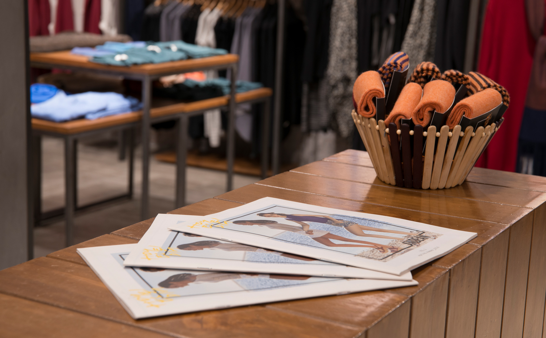
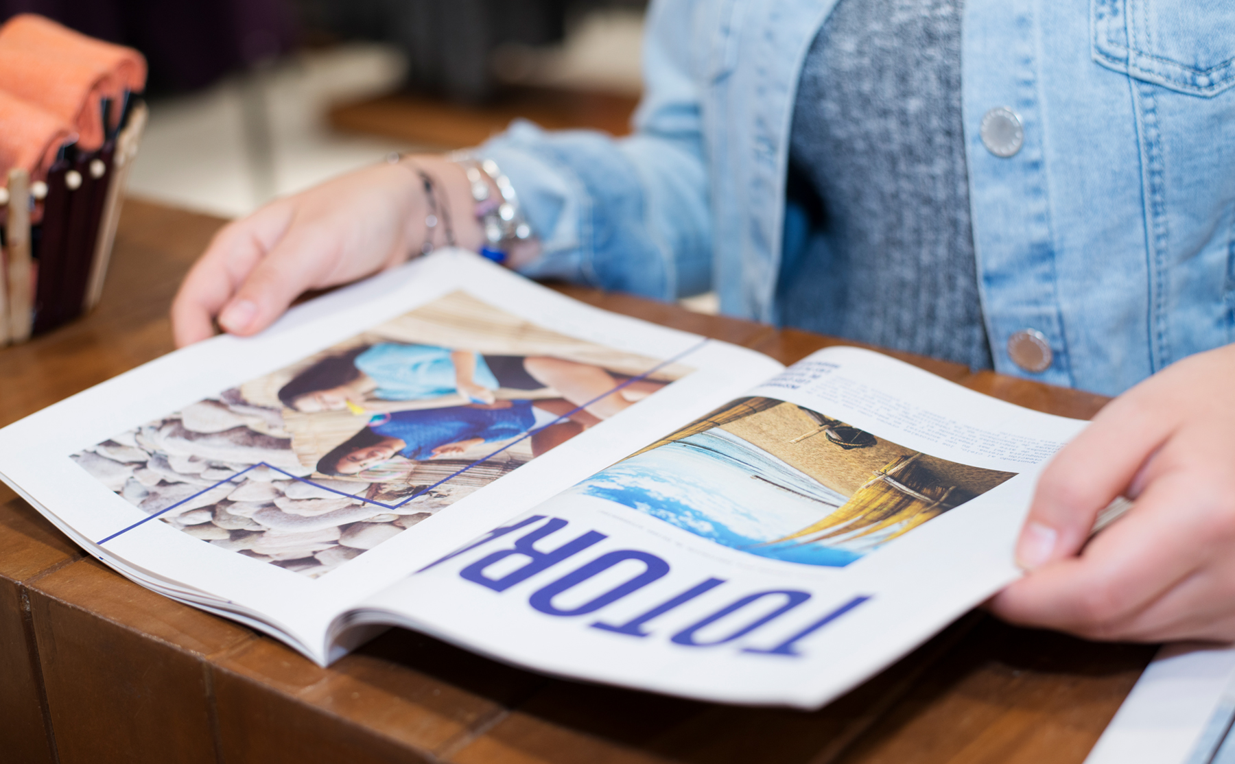
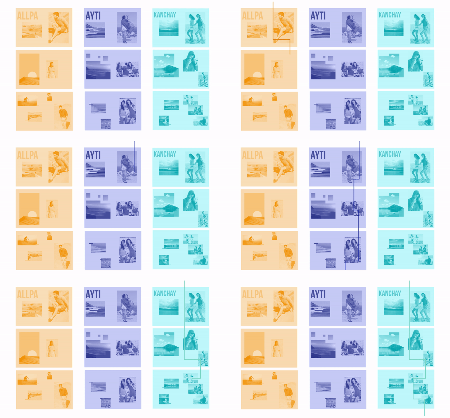
Editorial design. Andean, an alpaca retailer for the youth, set up a catalog for its summer collection. But it isn’t just a clothing summary. Instead it is full of cool hidden destinations. It’s a free guide distributed in stores that pushes its reader towards new adventures. Andean brought with them defined graphic guidelines that were applied to create continuity in their communication. The logo was the element used as a connecting wire, literally. Each one of the pages is appended to the previous through it. The graphic components: like the vibrant colors and the handmade text, are also part of the visual space of the brand. The magazine was printed in newspaper-ish paper to increase the feeling of a traveler’s guide.
