LA HELADERA
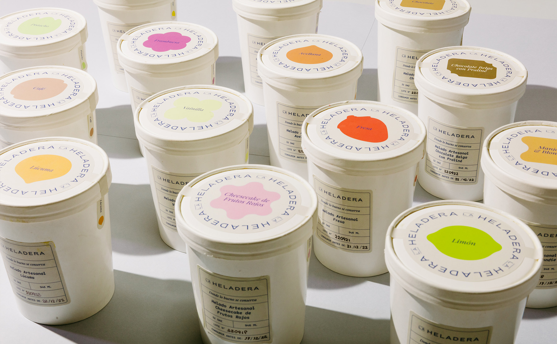
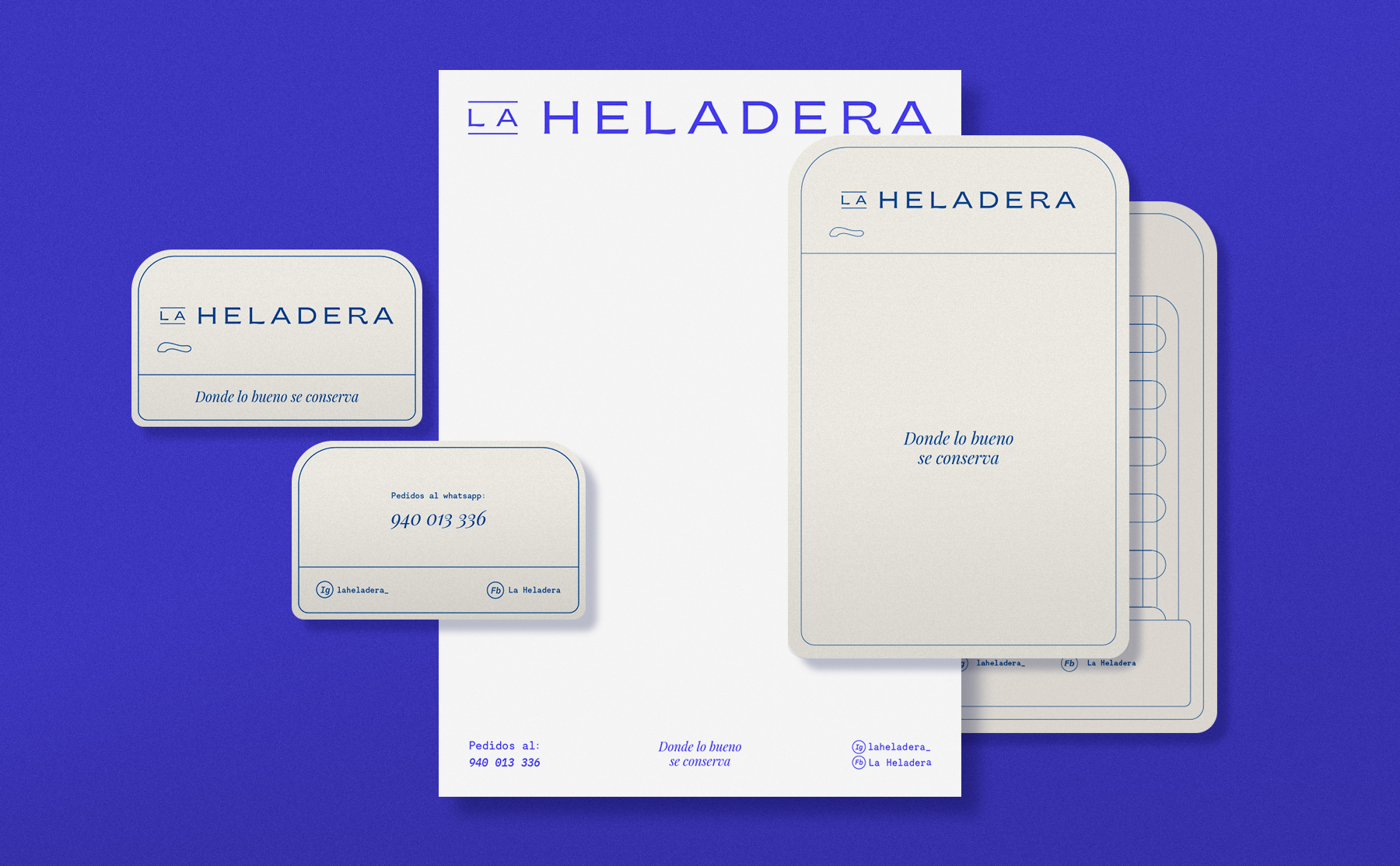
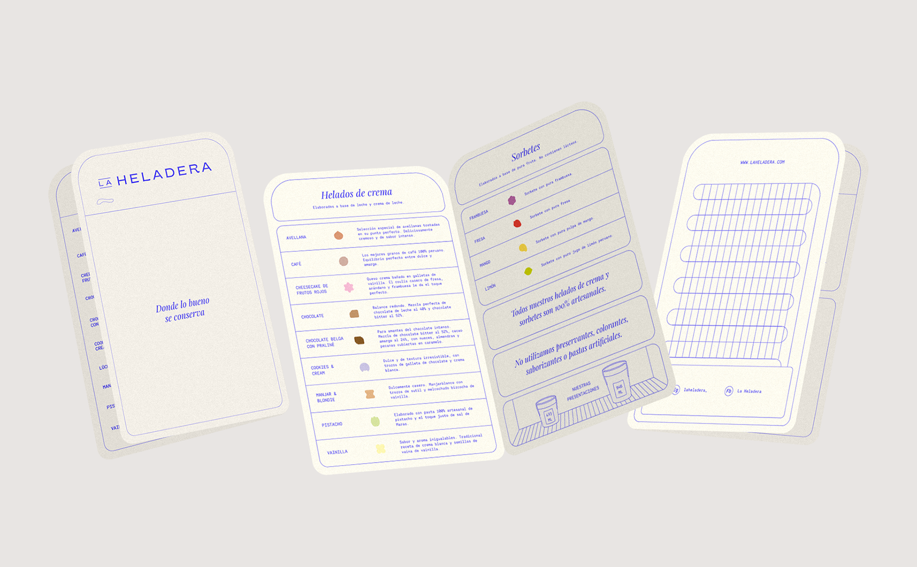
La Heladera is a brand inspired by the relationship between mother and daughter, ‘Las Elviras’, who share a love of baking and ice cream. They use the finest ingredients to create authentic and memorable treats, imbued with a spirit that reflects the passion and curiosity of a handmade product crafted with love. The name emerged from the concept of the physical space where our treats reside; this space, literally called ‘Heladera’ (fridge), led us to the slogan ‘Where the good stuff is kept’. Inspired by the world of freezers, we incorporated key elements of this object as a nod in the design; the logo and colours embrace a nostalgic aesthetic, whilst the graphics for each flavour were designed with hand-drawn strokes that lend an organic feel to the brand. In the digital world, La Heladera reflects its personality through high-contrast photography, highlighting details of the packaging, colours and shapes. The art direction of the scenes was created with a nostalgic and human touch to show that a product as beloved and everyday as ice cream deserves to be shared.